Third Place Books
Team Members: Daniel Hoang
Team Members: Daniel Hoang
Branding
Photo Treatment
Layout
Illustration
Photo Treatment
Layout
Illustration
CHALLENGE
Since its inception in the late 90’s as a local, humble and trusted bookstore, Third Place Books has experienced very little brand change. Their current collateral lacks cohesion and intentionality in fully reflecting their story.
Since its inception in the late 90’s as a local, humble and trusted bookstore, Third Place Books has experienced very little brand change. Their current collateral lacks cohesion and intentionality in fully reflecting their story.
SOLUTION
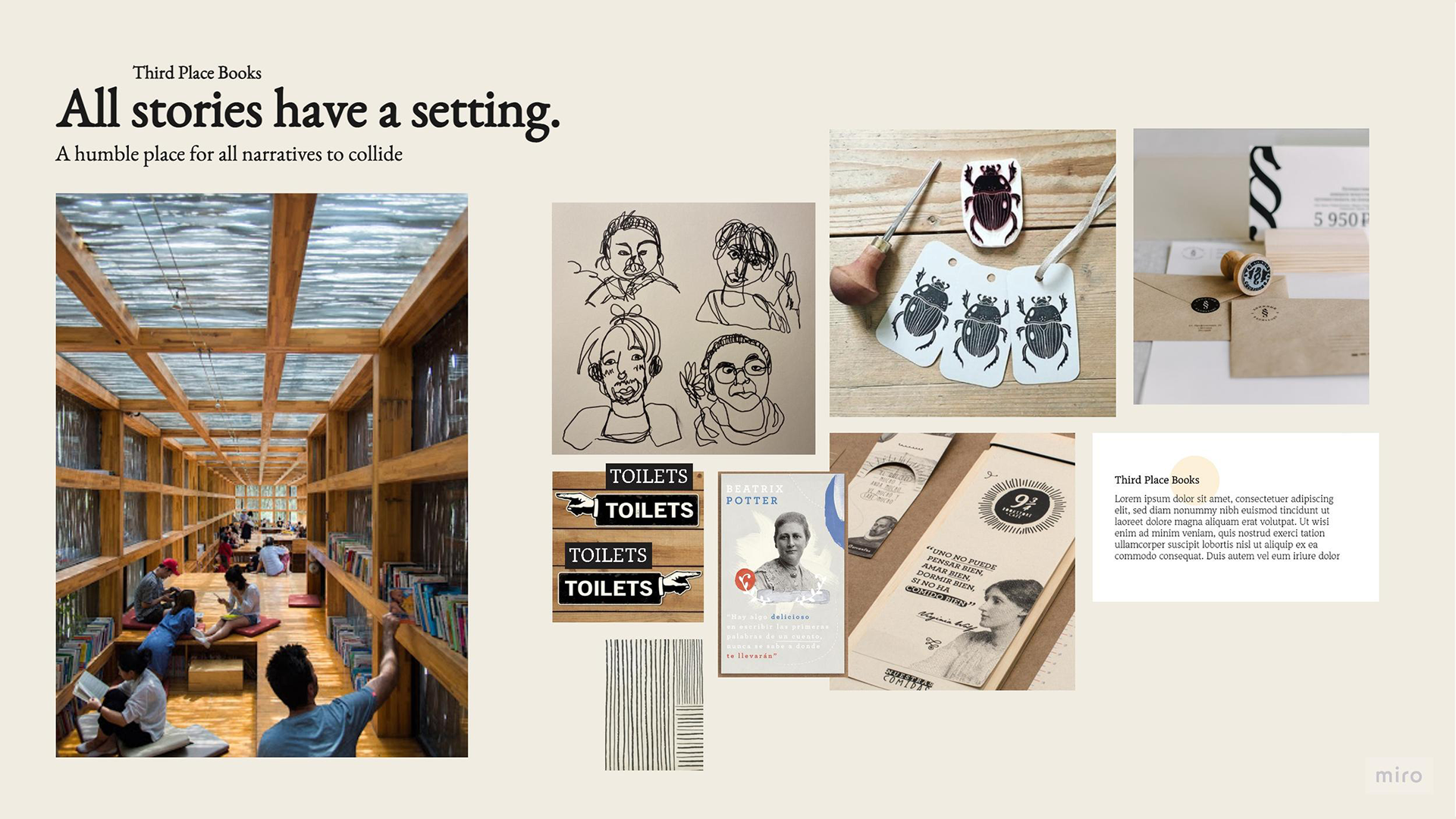
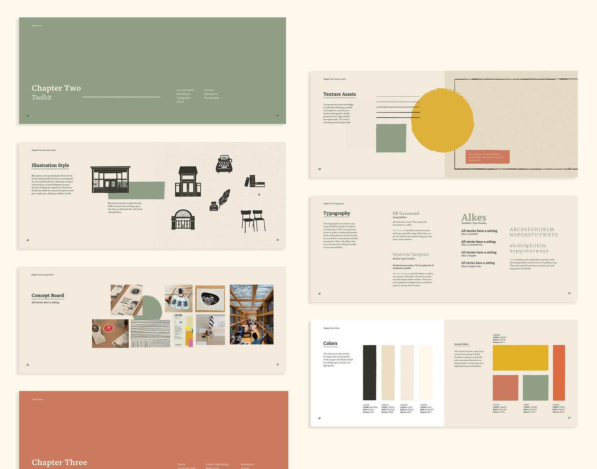
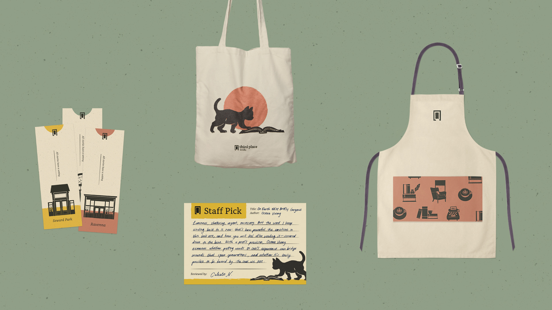
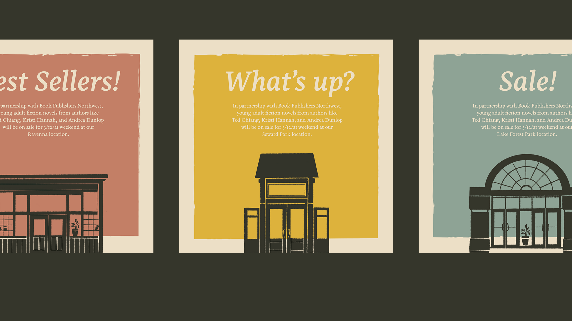
We knew what we wanted to express in our rebrand- the feeling of craft, locality, and community, however we could not pinpoint a specific execution through collateral. Prior to building our assets, we took into heavy consideration our central tagline “Every story has a setting”, an ode to Third Place Books’ inclusive spaces, and illustrated the 3 store fronts. We experimented with pushing the concept behind the storefronts further, highlighting the unique communal experiences in each branch. Not only did this approach tie our illustration assets together, it gave us an overall marketing approach that further sets Third Place Books apart from other local bookstores. We developed a consistent design system across a variety of media with a focus on Third Place Books as an inclusive space for local community building through uplifting the unique charms of their 3 distinct branches.
HISTORY & AUDIENCE
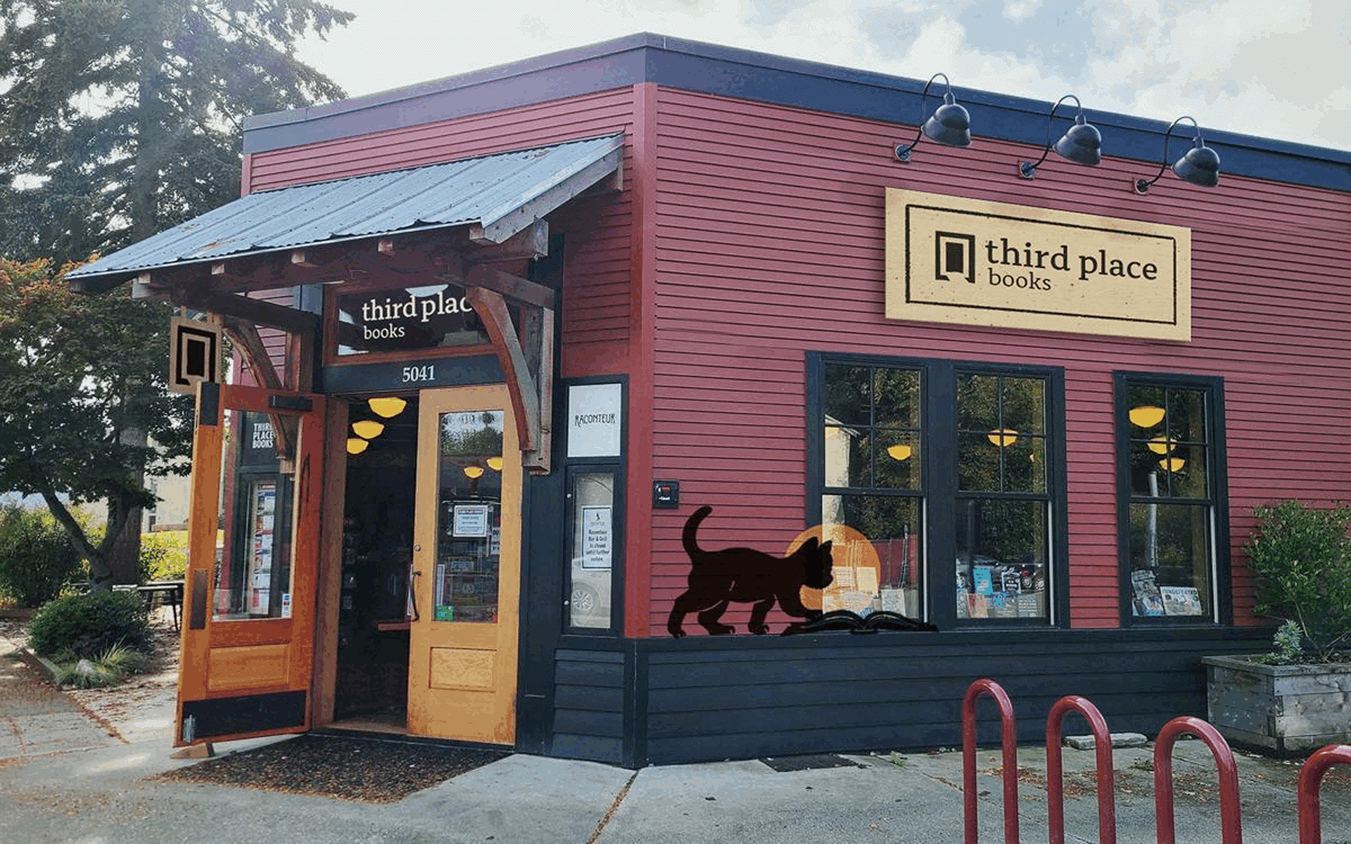
Third Place Books is an independent bookseller with three neighborhood locations in the Seattle area: Lake Forest Park, Ravenna, and Seward Park. These stores are the brainchild of the visionary Seattle developer Ron Sher, and the founding concept is described as the “deliberate and intentional creation of a community around books and the ideas inside them.”
Frequenters of Third Place Books tend to be locals nested deep inside Seattle neighborhoods due to the the branch locations. Book lovers with disposable income, usually running from youth to middle aged adults, tend to frequent the bookstore most due to independent publishing selections and live author events. A growing audience is minority-identifying young adults and teens due to inclusive author events and a close proximity to schools.
OUR NEW BRANDMARK
The new brandmark can be read as a book or an opening door, symbolizing Third Place’s welcoming values, beginning of a story, and dedication to craft. Its linocut-inspired pictograph is contrasted by its more friendly and delicate wordmark. This creates an approachably bookish lockup that is distinguishably hand-made. The logo will always be dark against a ligther background to emphasize the craft of linocut.
The new brandmark can be read as a book or an opening door, symbolizing Third Place’s welcoming values, beginning of a story, and dedication to craft. Its linocut-inspired pictograph is contrasted by its more friendly and delicate wordmark. This creates an approachably bookish lockup that is distinguishably hand-made. The logo will always be dark against a ligther background to emphasize the craft of linocut.


PROCESS AND CONCEPT BOARD
For a more detailed case study of our process, feel free to reach out to me directly.