Elysian Fields
Agency: IMDC
Role: Lead Designer
Agency: IMDC
Role: Lead Designer
Branding + Strategy
Visual Identity
Creative Direction
Motion Design
Visual Identity
Creative Direction
Motion Design
Overview
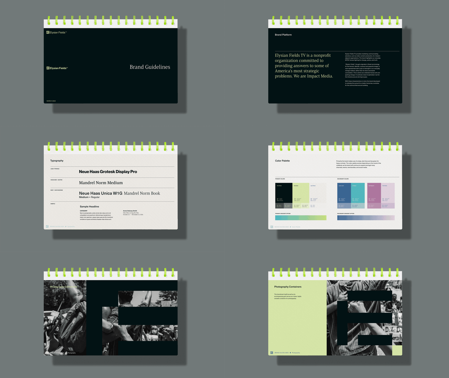
Elysian Fields TV is a nonprofit organization committed to providing answers to some of America’s most strategic problems. Elysian Fields impact media levels the playing field, helping to restore trust in journalism and hope for the future. We amplify the voices of highly talented women and BIPOC professionals, while helping to restore objectivity and nonpartisanship to broadcast journalism.
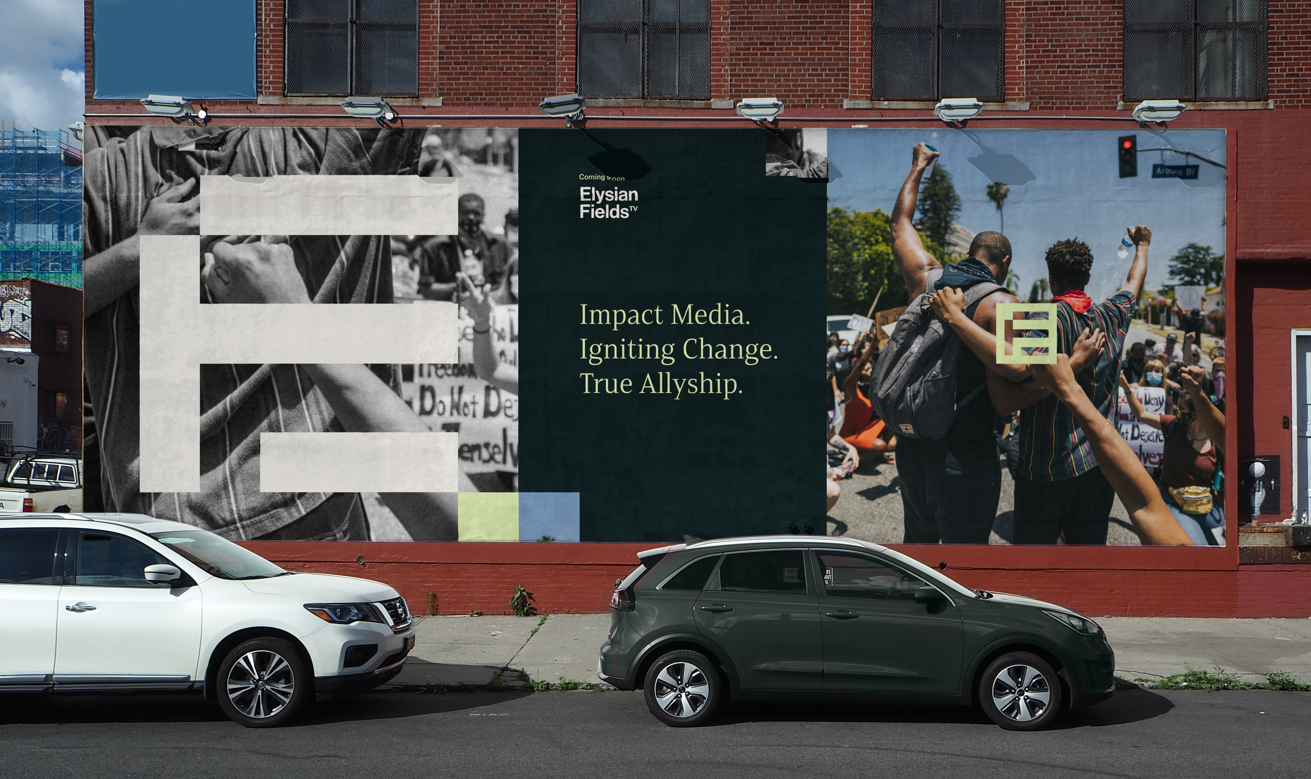
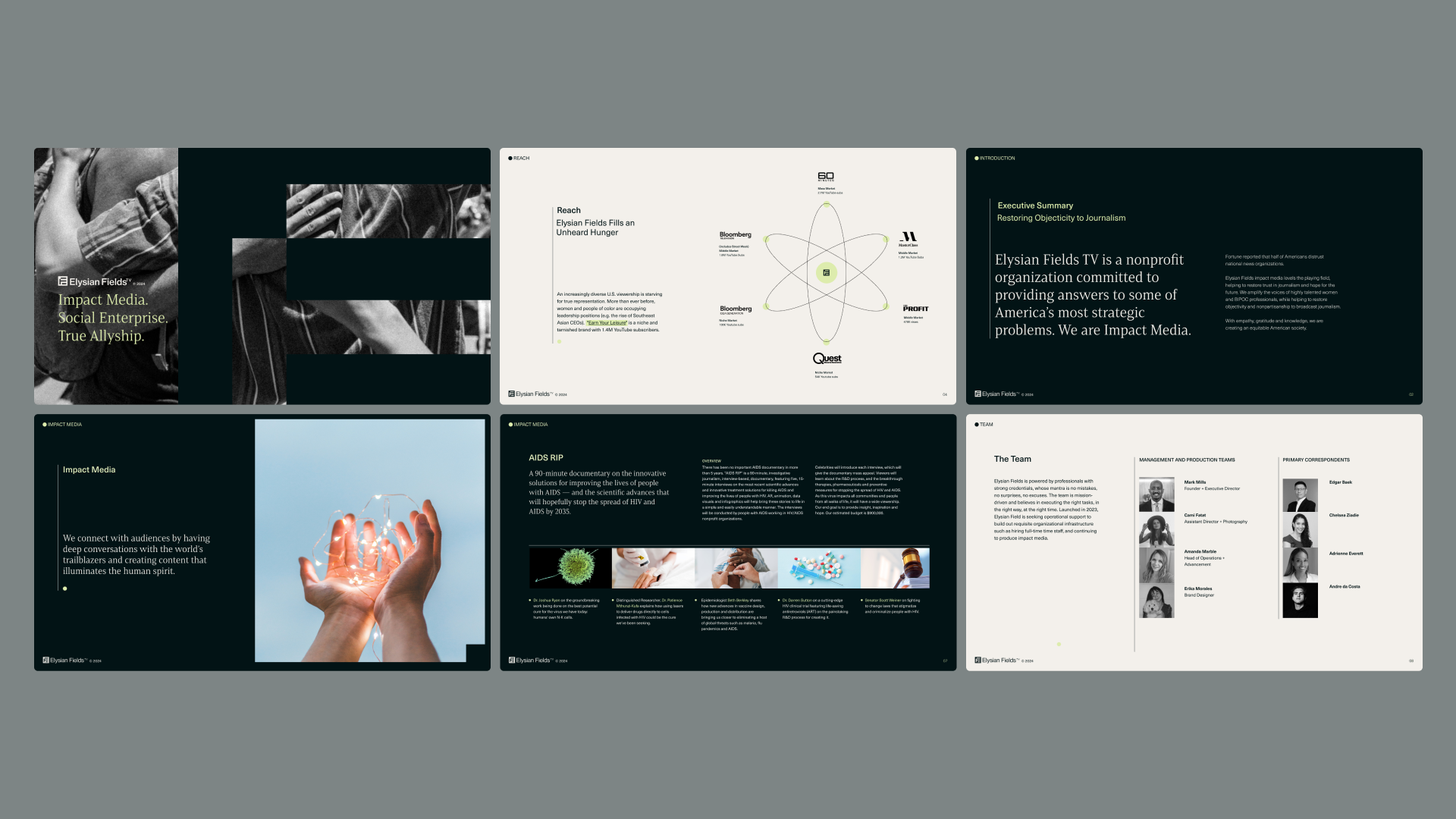
As Lead Designer, I conceptualized and executed a brand identity that reflected EF’s core missions and values: the pursuit for change, true allyship in our communities, and finding solutions for a brighter tomorrow.
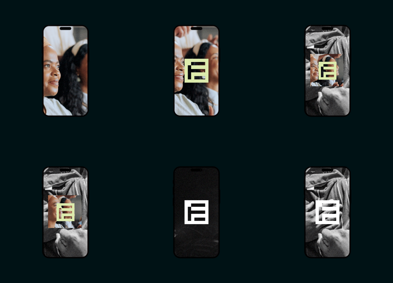
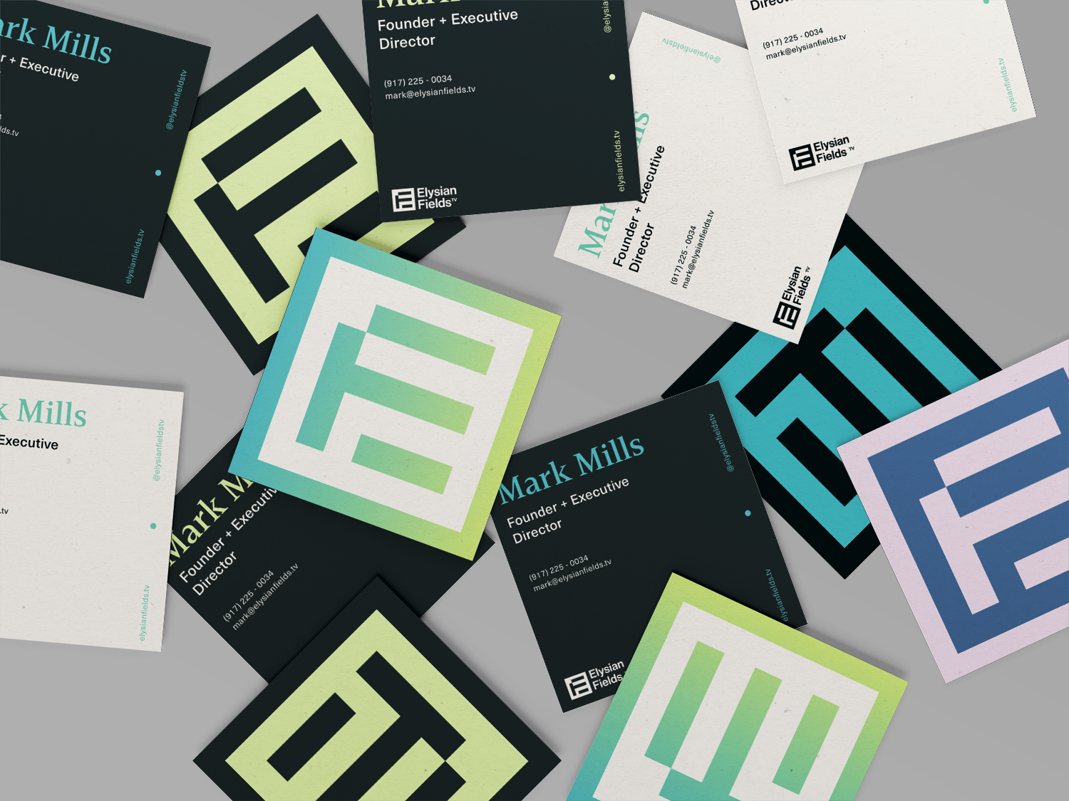
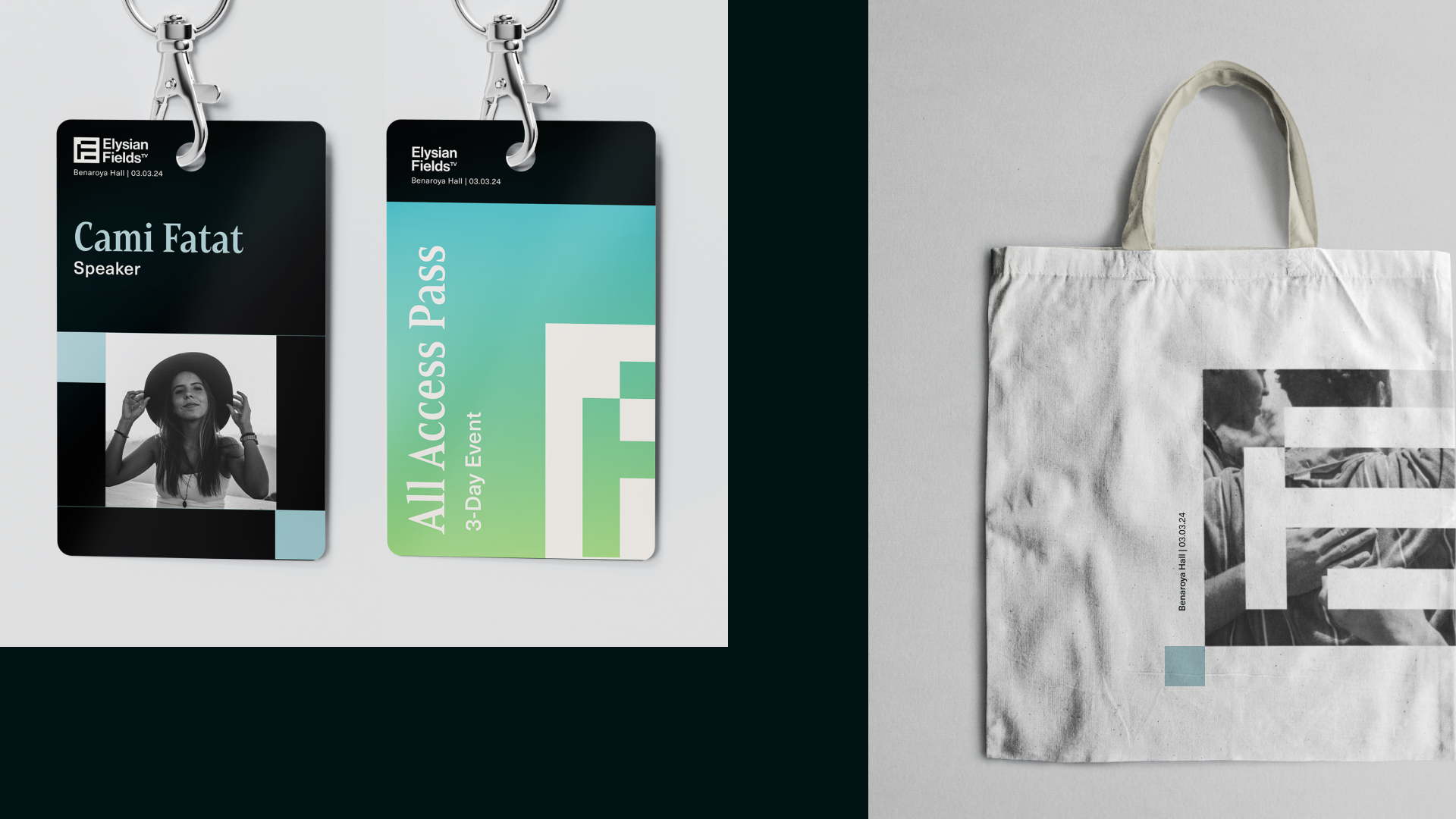
The brand execution is meant to be content and community driven- where the forefront of the graphics primarily source from EF’s shows or clips with similar tonality. The logo is the driving metaphor, as an ever evolving and versatile grid of screens- windows to witness our heroes working for change. There is a very slight nod to the stripes of the American flag, however not overtly patriotic. It is contemporary and almost editorially inspired, bold yet flexible, simple yet inspiring.
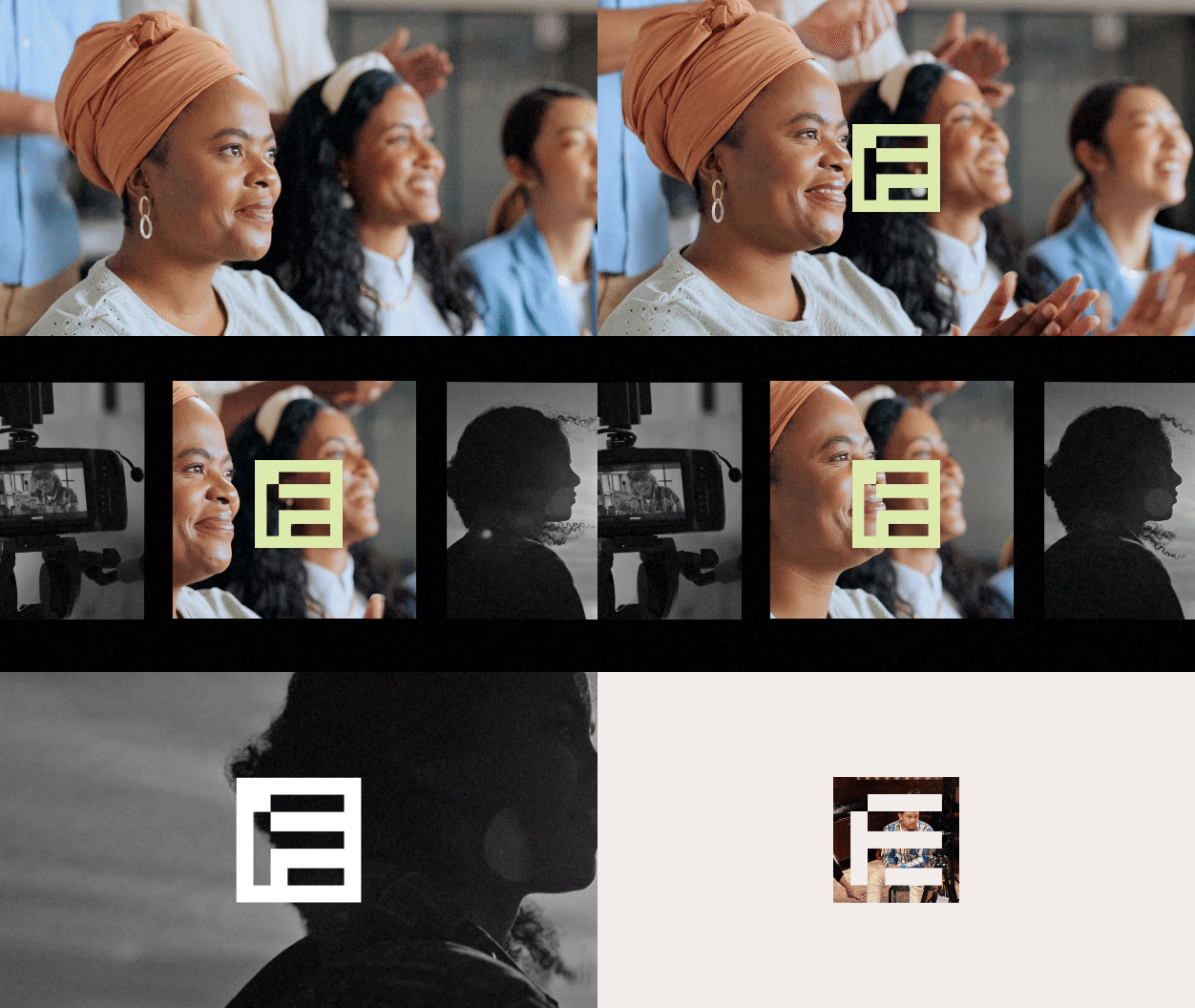

The Brandmark
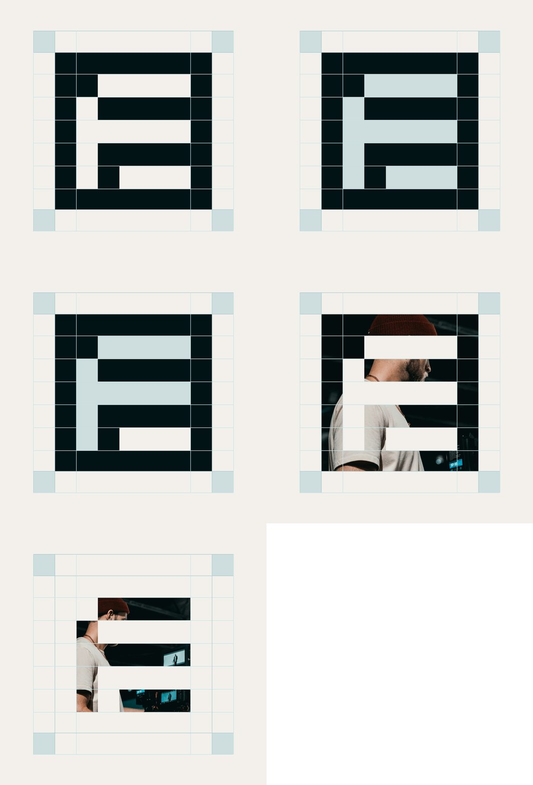
Simple, strong, versatile. The brandmark is a highly versatile graphic inspired by the acronym (EF) as well as the concept of an evolving grid of sceens and windows. As a media production company, EF is set to constantly evolve to fit a variety of content and genres. I wanted to make sure the base system was flexible in such a way that the brandmark could be used in a variety of instances- as a standalone, a texture, a photographic container, a layout reference, and even a guiding landmark for motion styles. The brandmark’s grid will later evolve into a starting point for future iconography systems as well.
Simple, strong, versatile. The brandmark is a highly versatile graphic inspired by the acronym (EF) as well as the concept of an evolving grid of sceens and windows. As a media production company, EF is set to constantly evolve to fit a variety of content and genres. I wanted to make sure the base system was flexible in such a way that the brandmark could be used in a variety of instances- as a standalone, a texture, a photographic container, a layout reference, and even a guiding landmark for motion styles. The brandmark’s grid will later evolve into a starting point for future iconography systems as well.

Fortnite Championship Branding
Agency: We Are Royale
Role: Designer
Agency: We Are Royale
Role: Designer
Branding
Environment Design
Social Media Templates
Broadcast Design
Environment Design
Social Media Templates
Broadcast Design
Overview
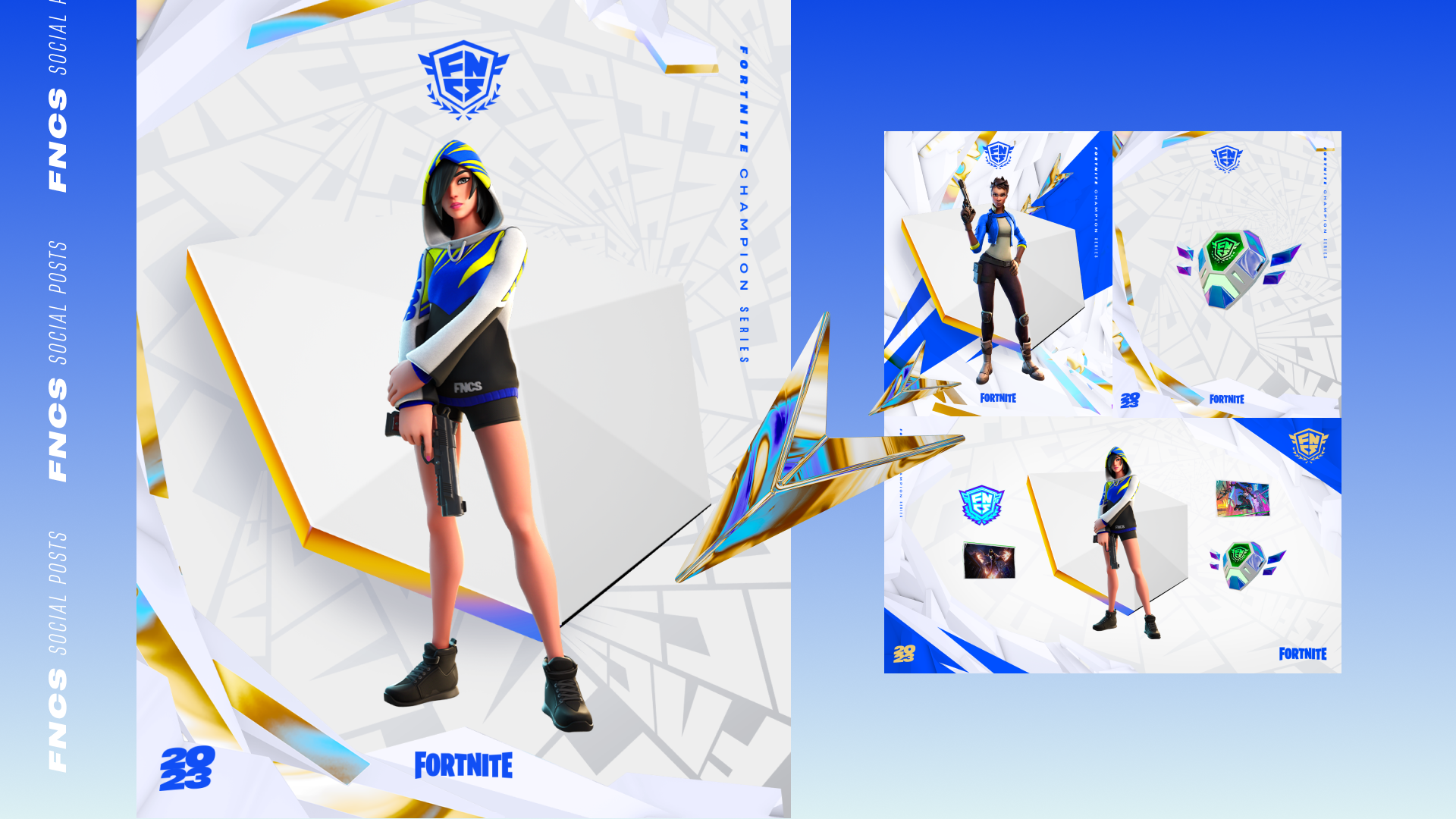
Every year Fortnite launches an extravegant event for its championships with an exciting, dynamic, and thrilling look. Using 2022’s setup, our agency refreshed the branding package for 2023 with a solid nod to its predecessor but with a fresh color palette and elevated design. I was in charge of social media collateral, production design, as well as wayfinding collateral such as pillar wraps and signage.
Every year Fortnite launches an extravegant event for its championships with an exciting, dynamic, and thrilling look. Using 2022’s setup, our agency refreshed the branding package for 2023 with a solid nod to its predecessor but with a fresh color palette and elevated design. I was in charge of social media collateral, production design, as well as wayfinding collateral such as pillar wraps and signage.



League of Legends: Star Guardian
Agency: We are Royale
Role: Designer
Agency: We are Royale
Role: Designer
Illustration
Art Direction
Styleframes
Art Direction
Styleframes
Overview
Riot called for a promotional campaign to mark its latest array of skins, cosmetics and new lore for its Star Guardian Summer Event. As a series of parallel universe skins under their League of Legends IP, the story follows a group of high school students who choose to become protectors of the celestial world by battling cosmic enemies who threaten their universe.
The summer event promo was encapsulated in a vibrant hero piece that drove excitement for the Star Guardian experiences happening across the League of Legends ecosystem: a motion graphics package, a high-energy barrage of channel flipping and anime-style infomercials in a League of Legends event trailer, a Wild Rift event trailer and an editorial piece for the Star Guardian event thematic.
I was personally in charge of collating anime references that paid homage to the magical girl transformation, with this direction in mind, I illustrated multiple backgrounds that encapsulated our intended magical school girl energy. Alongside backgrounds, I illustrated character frames, designed stickers for the brand media package, as well as styleframes and transition elements.

Slack | Your Work OS
Agency: State.tv
Role: Designer
Agency: State.tv
Role: Designer
Styleframes
Overview
Coming Soon
Coming Soon
Mental Health App Redesign
Agency: We Are Royale
Role: Designer
Agency: We Are Royale
Role: Designer
Illustration
Branding
Game Asset Design
UI/UX
Art Direction
Animation
Branding
Game Asset Design
UI/UX
Art Direction
Animation
Overview
We were tasked on a brand refresh for a mobile app focused on offering mental health resources as well as activities centering mental wellness through the form of shortform games. I was in charge of redesigning graphic elements, backgrounds, game assets, animation frames, as well as UI and branding elements. This rebrand focused on channeling serenity, peace, and the overall mood of being uplifted and offered mental clarity.
Disclaimer
Due to this project’s NDA, the company’s name has been ommitted, and collateral preview has been edited for discretion.
